When you’re designing navigation you need to keep in mind that on the web, signposts don’t just point, they also transport. The last time I had a big ‘navigation’ job on, I wrote about this. I observed that links on the web describe a destination and provide the means by which to travel there. Navigation is both information and affordance. When I wrote that post, I’d started to realise that this distinction might hold the key to making some design decisions more understandable and defendable, but I hadn’t quite boiled it down enough. I didn’t have a handy phrase or idea that I could trademark or get printed on a T-shirt. Today I think I’m moving closer.
What’s a menu for?

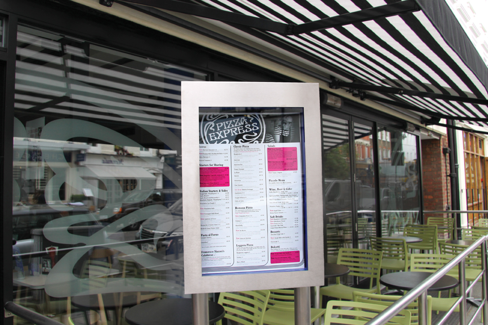
Have you ever been on holiday and walked around a restaurant district, pausing to peruse a succession of menus outside different places to eat? In the street the menu is designed to tell you what the restaurant has to offer, the prices, the type of establishment and help you decide whether to dine there. Menus outside restaurants are there for information. When you enter the restaurant the menu becomes the means by which you order the food. If you don’t speak the language or doubt the authenticity of your accent you might even resort to some pointing. Here affordance has entered the fray. It might just be a metaphor, but this story of the hungry holiday-maker perfectly illustrates what ‘the information to affordance ratio’ is all about.
When I say hypertext, I mean the simultaneous presentation of information and controls such that the information becomes the affordnance through which the user (or automaton) obtains choices and selects actions. http://roy.gbiv.com/untangled/2008/rest-apis-must-be-hypertext-driven
When I’m designing navigation for the web, I’m aware that at different points the user is either inside or outside the restaurant. But because menus on the internet are made up of hypertext, we’re always faced with the decision of how much information and affordance is being baked into our navigation. Being clear on the degree to which your ‘navigation’ is being used for both information and affordance will help you to make important design decisions. Where does the navigation live? How does it respond and persist? What does it imply about the structure of your site or product? These will all affect your view on the extent to which your navigation is providing information.
I suspect that the ratio has become more of an issue since we’ve started hiding navigation off-canvas. Anthony Rose writes persuasively about side-drawer navigation, and the persistence of navigation being something to carefully consider. We’ve always known that the words we put in our navigation, the ‘information scent’ we bake into our affordances is important. But I think the demands of designing responsive navigation is highlighting the careful interplay between information and affordance.
As I continue to spec new navigation interfaces and designs I’m going to start annotating the specification with an actual figure for the ‘information to affordance ratio’. I think this will force me to consider what I’m expecting this bit of interface to do for me [the organisation] and deliver to the user. I think it will also give me a focus to talk to other designers about the rationale and thinking behind the IA recommendations I’m making, helping them to make decisions further down the production process.
I’m hoping that the information to affordance ratio is a helpful, clear, easily understood value you can ascribe to both navigation requirements and solutions. I’m also hoping to get a T-shirt printed very soon.
Leave a Reply