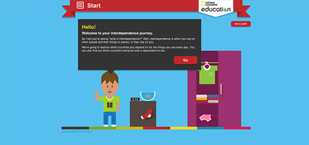
This project was my first major foray into responsive design for heavily interactive elements. We took a mobile first approach. Having storyboarded the tool and interactions, we knew there were going to be challenges. A lot of the tool is about selecting objects to put into your virtual wardrobe. We didn’t want lots of dull drop-down lists to be the main interaction on the phone, so we worked hard to make the experience colourful and creative no matter what device you were using.
We also adopted a flat design aesthetic. It seems we did a fairly good job, and the site is now being used as a ‘best practice’ example by sites like Smashing Magazine.

Leave a Reply