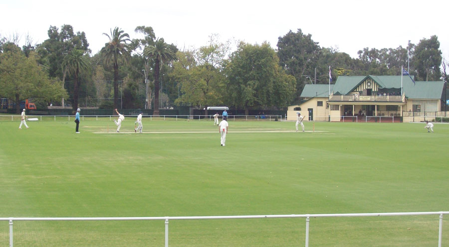
If you want to understand something, look towards the boundaries*
The edges of things are interesting. IAs should be comfortable identifying that distinct boundary that marks the end of one thing and the beginning of another. We know the power of thinking about the ‘thingness’ that makes a thing the thing that it is. But we also know the power of the seams and loose joins we can use to connect things.
My model of navigation extends beyond the behaviours that we typically think of as navigation. It incorporates things that aren’t navigation. But these things often sit beside it in the story of an experience. Some of the navigation behaviours I’ve described aren’t particularly enjoyable. Most times ‘navigation’ is only ever going to be a means to an end. This category considers the ends (and beginnings) of the other navigation behaviours.
* This is particularly true of cricket, where the boundary is an essential part of the scoring mechanism.
Consuming

Most of my model focuses on movement and discovery within information-rich environments. But if the pathways and furniture that support that movement and discovery are ‘multifaceted rainbows’ – consuming is the pot of gold at the end of the rainbow. People come to the places I design to consume stuff. It’s usually words, pictures, sounds, videos – content. Yummy content.
There are certain type of consumption that you can improve by borrowing some thinking from navigation. Learning is a type of consumption where information discovery is inherent. There’s a strong sense of movement and progression through learning content. If you’re designing learning you should consider some of the behaviours named in the model.
But at other times it’s useful to think of consuming as a different mode that has a beginning and end. Consuming is usually either preceded or followed by navigation – so there are opportunities there. But during a focused period of consumption you should make sure your navigation can fade into unconscious attention. Consider the controls of most software video players fading out as consumption begins. They can return during interaction with the interface. But at times it’s entirely appropriate to take the furniture of navigation away.
Consider the seams where a user might switch mode into consumption and out of it. How do you support this switching? Similarly, are there ever legitimate reasons to interrupt the actor? How might you do that with skill?
Information:Affordance = 90:10, focused and content.
Grazing

Mid-way between consuming and a type of undirected browsing, grazing is consumption without the same levels of attention and commitment. This could describe the ‘smartly bored’ state of someone passively monitoring a coarse aggregation of information. It could stretch to consider the consumption of a video playlist when you’re not really paying attention – a sort of ‘nihilistic nexting’.
It’s a form of movement through content, rather than using the furniture of navigation. But with so much content providing the means of navigation, it’s important to think about. Grazing often doesn’t have a goal, except to spend some time. So it is fertile ground to try to turn into more focused consumption or information seeking.
Grazing will (usually) only result in the discovery of unknown information – due to it being undirected. The actor may only dedicate passive attention during grazing, so barriers to differentiation and recognition should be lowered to support this behaviour. Grazing may result in some form of passive conditioning where a specific need develops and another behaviour begin.
Information:Affordance = 60:40, on the lookout for stuff.
Orienting

This is the final behaviour set in my model.
Structures imply a spatial aspect to designs and experiences. Orienting within a structure is necessary to move with confidence and intent. Orienting will see an actor locating themselves within a structure and/or verifying their mental model of the structure.
Orienting is easiest in relatively stable and static structures. Traditionally navigation in the form of menus has clearly communicated a structure and the location of the actor relative to the structure. Breadcrumbs have also been used to help orient an actor and sometimes to describe their journey.
Moments of orientation are like breaths in the flow of an experience. Sometimes engineering those moments is helpful. Showing the stages of a fixed static process – like a checkout process – gives an actor confidence and predictability. Providing ‘landmarks’ within a structure can foster trust.
The ability to ‘orient’ is the biggest benefit of a well-architected system or service – it empowers the actor to make sense of wherever they are or find themselves. It enables task completion, sessions to be broken and returned to and the transition between different information seeking behaviours. Orienting will usually be close to the beginning and end of most information-related tasks.
Information:Affordance = 85:15 – impatient but uninformed / “let me get my bearings.”
A means to an end
So there you have it. My model of navigation.
This is still a work in progress. And it is a means to an end. A model is designed to communicate an idea or unlock insights. It’s a way of translating and transforming ideas – combining and containing them. This model is designed to help IAs and designers move up and down levels of abstraction to consider user needs and the behaviours a design should support.
In my final post on navigation (for a while) I’ll be sharing materials, tools and techniques I’ve developed to make this model more useful. I’ve written nearly 5,000 words on this model this week. Tomorrow I’ll tie it all together with some ideas for materials and a rough workshop plan that you can use to apply this model to the audiences for your product or service.

Leave a Reply