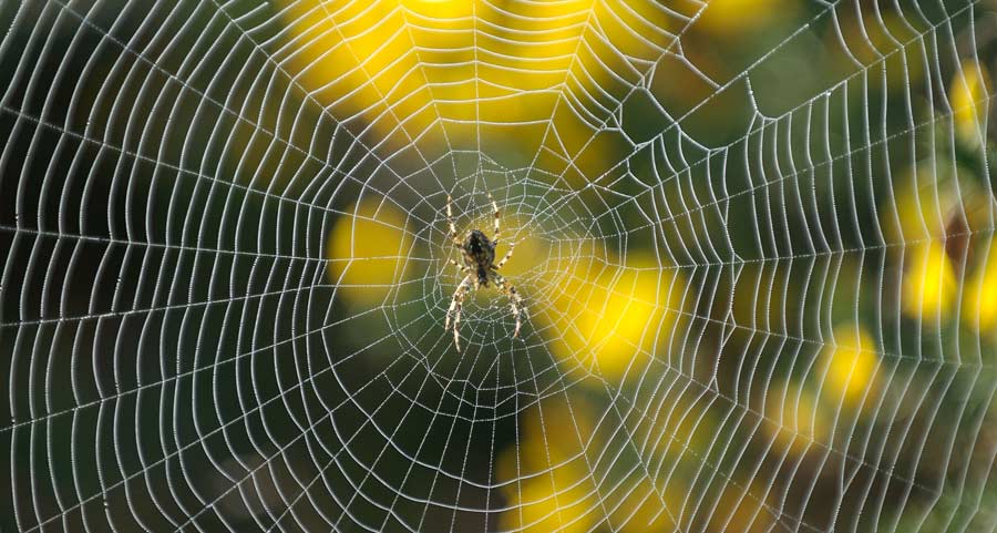
Most of us use the terms internet and World Wide Web interchangeably (I tend to use ‘web’, it’s the shortest). Both names focus on interconnection – strands woven together. But the majority of structural information architecture doesn’t stay true to the spirit of these metaphors. We’ve broken the promise of the web by building trees (and odd trees at that), not webs. And as expectations for what the web can deliver continue to evolve, I think we might be in danger of building the wrong sort of structures.
Motorways and junctions
Much of the information architecture we continue to create plays to the strengths of the web. But it’s rare that we stretch ourselves to consider how we could build a more web-like web. Navigation on the internet has been built on the shoulders of the humble hyperlink. Hyperlinking is based on a 1:1 transaction. Some text links to some (specific) resource. We’ve built our websites and menus using this type of transaction. And because links are a representation of a destination, and space and comprehension in structures and experiences are limited, we built (index) pages to act as the more complicated junctions.
We’ve used these two structural elements to create the ‘spaces’ on the web. Menus are static, structural and skeletal. They’re therefore reliable but reductive. Index pages do the heavy lifting. They can be exhaustive, so are more likely to be occasionally exhausting. Structural information architecture is designed to do two things – tell a user where they are and where they can go. But the affordances that we’re able to build into our structures using the 1:1 transactions of address-to-resource linking doesn’t really support multiplicity. The way we’re imagining the web is perhaps a little one-dimensional (or 2d at best). We’re building spaces on a web, rather than webs.
Let’s make webs not trees
I think there’s a danger we continue recreating the hierarchy of tree-like structures rather than the rich interconnectivity of a web. Maybe we’re just too focused on the internet of documents and retrieving resources, rather than crafting interactive experiences. We’ve built the three-dimensional structures that our websites represent by presenting multiple simple links. The point-to-point scaffolding provided by hyperlinks gave us our ‘information superhighways’. These motorways lead to dense junctions that users must scan and evaluate to find the next point and shoot projection for their preferred journey. This fast-slow, back-and-forth, converge-diverge of the web is what typifies navigation around our web structures. As designers we’re comfortable with a bit of divergence and convergence. But is this really the best experience we can build for our audiences? Is there a way to reconcile the 1:1 nature of linking on the web with the reflexive, expansive power that a weblike structure would enable?
We can never alter the 1:1 nature of the weblink, and nor would we want to. But this is pretty much the only constraint we have when thinking about the types of structures we can create. Building digital spaces for individuals to navigate is a lot more empowering than playing with bricks and mortar. We should be more ambitious. Rather than asking the user to shift focus between micro and macro structures, motorways and junctions, can’t we give them a consistent set of tools to discover and use the “where they are and where can they go” information more artfully?
Spiders not squirrels
I think we’re too fond of treating users like squirrels. We let them scamper around our tree-like structures dragging their nuts around with their energy and enthusiasm being diminished by the structural elements of our designs. What we should be doing is letting our users be a spider on their own personal web. The experiences we design should constantly place the user at the centre of their own web. The structural elements we put in place should allow the user multiple options.
[blockquote]The experiences we design should constantly place the user at the centre of their own web.[/blockquote]
I’m not sure whether this is some new type of browser, powered by linked data to add nuance and enable hyperlinking to retain it’s predictability but also facilitate 1:many type transactions. Or whether we need to look to the way apps create eco-systems in which more complex navigation paradigms can flourish.
I think we need to find ways to create navigation based on a principle of ‘responsive reductivism’. Structures on the web should maintain their consistency and convey only enough information to empower the user to understand where they are and where they can go. But spiders have got eight eyes, six legs and powerful mandibles. Their most important asset is their ability to build personalised structures wherever they go. Maybe we need to spend less time building structures and more time developing the tools to enable users to build their own.


Leave a Reply