Navigation is both a noun and a verb. It’s the furniture that people use as they move through online experiences, and the experience – the journey. This post is about how the furniture can affect the experience to create branded online experiences and navigation.
How does it feel?
I like branding. I used to work for a design agency that created and curated brands, and I’ve even written a fair few brand guidelines in my time. Great brands elicit reactions from their audience. They inspire this response because they initiate and maintain relationships. I think that branding online experiences is even more important than applying a brand to something in the real world.
Because lots of the stuff that I make doesn’t really exist. It’s all virtual. Virtual spaces are populated with virtual objects. Words wait to be translated from their shapes into the thoughts and ideas they describe. I spend my time creating the intangible. And most of the time I’m giving these things away the moment they find their way online.
Online experiences belong to the audience. But I think they are shaped by the context in which they are consumed. If you have a good brand, and you understand it, you’re able to afford online experiences that belong to the brand and the audience. Brands become a mediator in the creative act the user undertakes when they create the experiences that your content is designed to afford. Brands create a shared context. With a good brand the audience or user becomes a fan. All their interactions feel as though they belong to them and to the brand – these kind of branded experience are really good examples of co-creation. You and your fans share control.
So brands are important from the point of view of the heart – they affect the way we feel about experiences. But they also have a role to play in supporting the head. Online content can suffer from an identity crisis. Without a strong brand, even without clear information architecture, content can easily go forth into the world without any real sense of what it is about. It’s no wonder then that sometimes users (including computer users like search engines) can struggle to work out why our content is worth their attention. It used to be that content derived at least some of its sense of identity from where it lived, but with bigger, flatter websites, we can’t even rely on that anymore.
I mention this because I’m trying to get to the bottom of my signature branded navigation experience. It’s not my personal brand, of course, it’s for the product I’m currently working on. Happily I happen to really believe the brand proposition, so it’s becoming something of a personal mission to espouse the ideas around this way of getting around the web.
The furniture and the feelings
I work in education and it’s always annoyed me when I’ve worked with VLEs (virtual learning environments) where the navigation is the difficult thing you do before the learning. Moodle used to drive me mad. It didn’t seem to me to have been designed for learners. It took the concrete way that education was organised in the real world and created an abstract model that you could navigate around if you already understood the ‘real world’. This is OK when such an environment is supporting real world classes and interactions, it just didn’t feel like a digital-first solution [which is why I think it is particularly difficult to use Moodle (and most variations) in corporate settings]. Because learning is about discovery and finding your way to new knowledge. Navigation has a big role to play. I think navigation during online learning should feel like it’s part of the learning journey, not the bit in-between the learning.
Learning online works best when designers have taken time to think about motivation. Online learning needs to be able to motivate users. I think learning can be made to feel ‘easier’ when effort is removed from the navigation stage. I think we can use curiosity to make the gaps between the content feel like frictionless steps, rather than jarring jumps. Experiences always invoke an emotional response. And seams are stressful.
All online experiences are interactive. And a lot of this interaction occurs during ‘navigation’. Users move around the web to create journeys through our content. And even from the first days of the web, the medium has been mixed with the message. Hyperlinks are both content and links. Navigation objects describe a place and take you there. Navigation objects will always be an important ingredient in the interactive experience. Navigation is therefore a great way of turning consumption into conversation, as it enables a user to interact with content to shape their journey.
[blockquote]There is a difference between the feeling you get as you move through an experience and the furniture you use along the way. We need to think about both.[/blockquote]
The types of navigation furniture
I like to think that there are broadly three type of navigation furniture:
Structural – this is the menu-y type of stuff that establish sections, hierarchies and reveals the shape of your IA – the skeleton. It tends to support vertical movement, but can also do bits of lateral movement too.
Associative navigation excels at the lateral movement. It’s great for the sideways jumps. It’s the kind of navigation that would get you from this page to Kevin Bacon – no-one has designed a menu to do it, but there’s probably a path out there somewhere. This is more like the fibrous flesh – intertwined and structured.
Utility navigation allows you to mix menus with functionality. Personalisation, dashboards even good old fashioned search get users to destinations, so it is a form of navigation. It’s the rest of the body – special little bits that do specific jobs really well.
These form the tangible bits of interface that people use to move around our online spaces.
The types of navigation behaviour
Each of these three types of the furniture of navigation support different types of navigating behaviour, and to varying degrees. User want different things at different times, and their behaviours adapt and change accordingly.
Known term (search) sees people looking for a specific thing. They usually have a key word or key phrase in mind and they’ll use this to get to where they want to be.
Exploratory seeking occurs when people know what they’re looking for and have a decent idea of where to find it. During most of this type of behaviour users will be referring to a mental model of the domain, occasionally pushing it out at the edges and comparing it with the IA they’re seeing as they move around the web.
Discovering unknown needs will usually happen during an exploratory seeking session, where the users finds that their mental model is missing a huge chunk. They’ll discover that unknown needs exist and will navigate around supplementing their mental model until they can switch mode back to exploratory seeking.
Re-finding is the final type of navigation behaviour. It’s interesting because it forces us to think about the findability of our content from the other direction. Refinding stuff in the real world depends on landmarks and memory of our users. Online we need to decide what, in addition to search, we’re going to offer users to ensure they can re-find our content.
In online learning I think users exhibit each of these four behaviours. I think users tend to switch between the middle two modes regularly when they’re learning online. And I think we want them to flow between the two states – exploratory seeking and discovering unknown needs. There is a difference between way-finding and discovery. I don’t believe a navigation system focused on way-finding is the best way to afford learning experiences, it’s too likely to give users what they expect rather than what they don’t know they need.
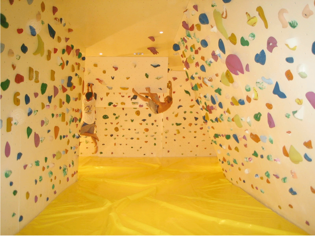
Wall and ladders
Unknown needs are a recurring theme in my IA world, Donald Rumsfeld was on to something. There is loads of stuff out there that you have no idea that you would find fascinating and interesting and could satisfy a need you don’t know exists. Navigation should empower users – it should give them the chance to know the unimaginable.

An over reliance on structural navigation can create silos of content that feel like ladders. Ladders are great, particularly in building maintenance and feline retrieval scenarios. But jumping between ladders can feel precarious – there’s that dizzying moment in any ladder ascent when your centre of gravity is supported by nothing and for a second you’re flying – in a frightening way rather than being exhilarated. Ladders can make navigation feel risky, as jumping sideways forces you to reorient yourself on your new ladder. They also focus you on a path. It’s difficult to jump any further than a couple of rungs. They’re prescriptive. The experience of the content is mediated by the IA, not supported by it, because the structural navigation is an abstraction of the content. Users need to interpret and understand the structure before they can focus on the content.
Climbing walls are different. Walls can turn navigation on it’s head. Navigation can become a physical manifestation of a graph using a linked data-driven information architecture. We can cram our navigation full of information scent, setting expectations and creating navigation that feels more like a recommendation engine than a set of generic signposts. Navigation can adapt and re-orient itself around the user, because the content becomes the navigation. Any page can be a homepage (thanks to search). The user is at the centre of their own experience, they’re never really three rungs down our carefully prescribed structure. We can leverage the reliability of search to support re-finding and known item search. But our online spaces can be fairly flat structures, dense with associative links and interconnections between content nodes.
What does this mean…
Navigation should be consistent with the brand and personality of the space you’ve created. It should also be consistent across the sites that use the brand. And it should adopt a coherent paradigm that can be exploited at launch and as a product evolves. Navigation should support both vertical and lateral movement through the product. You should support two user modes – navigation and consumption. But prefer consumption – it feels more satisfying.
The challenges for information architecture in the future will not be information organisation challenges – it will be making navigation feel like consumption. We need to all recognise the distinction between where content lives and where it can be found or accessed. A commitment to technologies like linked data will ensure that our content can take its context with it – we’re less reliant on identity being derived from location. And because we’re less reliant on this structural IA to tell content what it is about, content loses it’s identity crisis.
We’ve all got a choice when we think about the type of experience we want our navigation to afford. Climbing walls and ladders are the way I’ve been thinking about the way a user will feel as they move around the spaces I design. Both activities require motivation, but one feels much more enjoyable and satisfying.
Leave a Reply